
CURE - Design
Monitoring. As many solutions as there are things to monitor. Like most people working on most IT-departments, me and my team are faced with a plethora of different sources of alerts and events. Email. Slack. Teams. SIEM. SysLogs. EventLogs. RSS. Tickets. Portals and Health pages. It’s a pain to go through events, and difficult to get an overall feel for the current state of things. You know the feeling. How can we make this better?
The vision
I want something simple that can give me the current state of IT at a glance. I want RED/YELLOW/GREEN. I want the overview to be easily accessible, whenever I want/feel like it. I also want the possibility to see more details on a specific event. WHEN I want. I also want anyone on the team to be able to contribute, not just the PowerShell/Python-savvy. And last, but not least, I want to put this up on a wall mounted monitor at each IT department at the company (we have several offices around the Nordics), so everyone can see the status!
The Design
I previously had built a monitoring system entirely in PowerShell that basically outputted static HTML for consumption in a browser (set to auto refresh). I want to keep the good things about that system (easy to modify/extend) but make it more flexible and easier to maintain and less resource intensive. The previous version was an exercise in module-writing and runspaces, so I want CURE to be simpler.
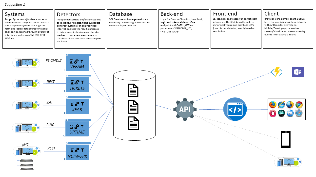
I also made a drawing with pointers to how I imagined the UI to look.
The components
A quick walkthrough of the components in the above design.
SYSTEMS
The systems/data sources to monitor.
DETECTOR
The function, usually a script, that collects the data from the system, analyzes and posts to the database.
DATABASE
Persistent storage for events and settings.
BACK-END
Api and some logic.
FRONT-END
JavaScript and CSS.
CLIENT
Primarily a browser but possibly something else later.
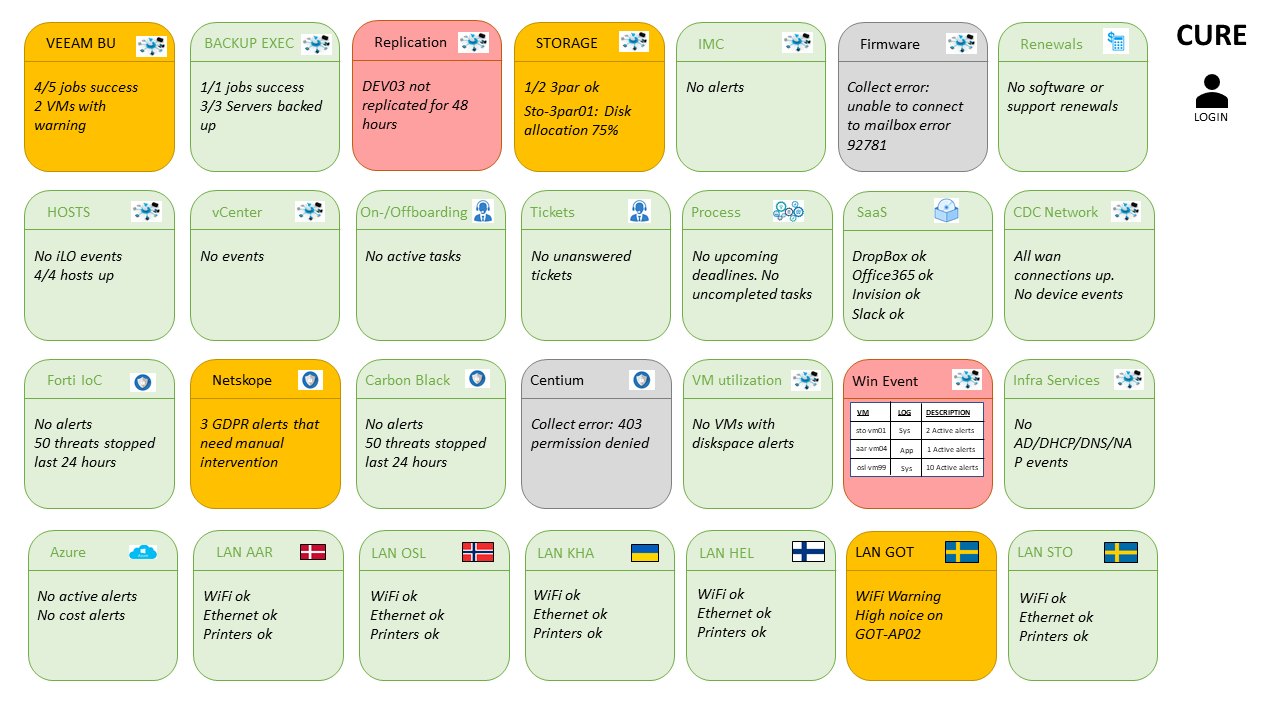
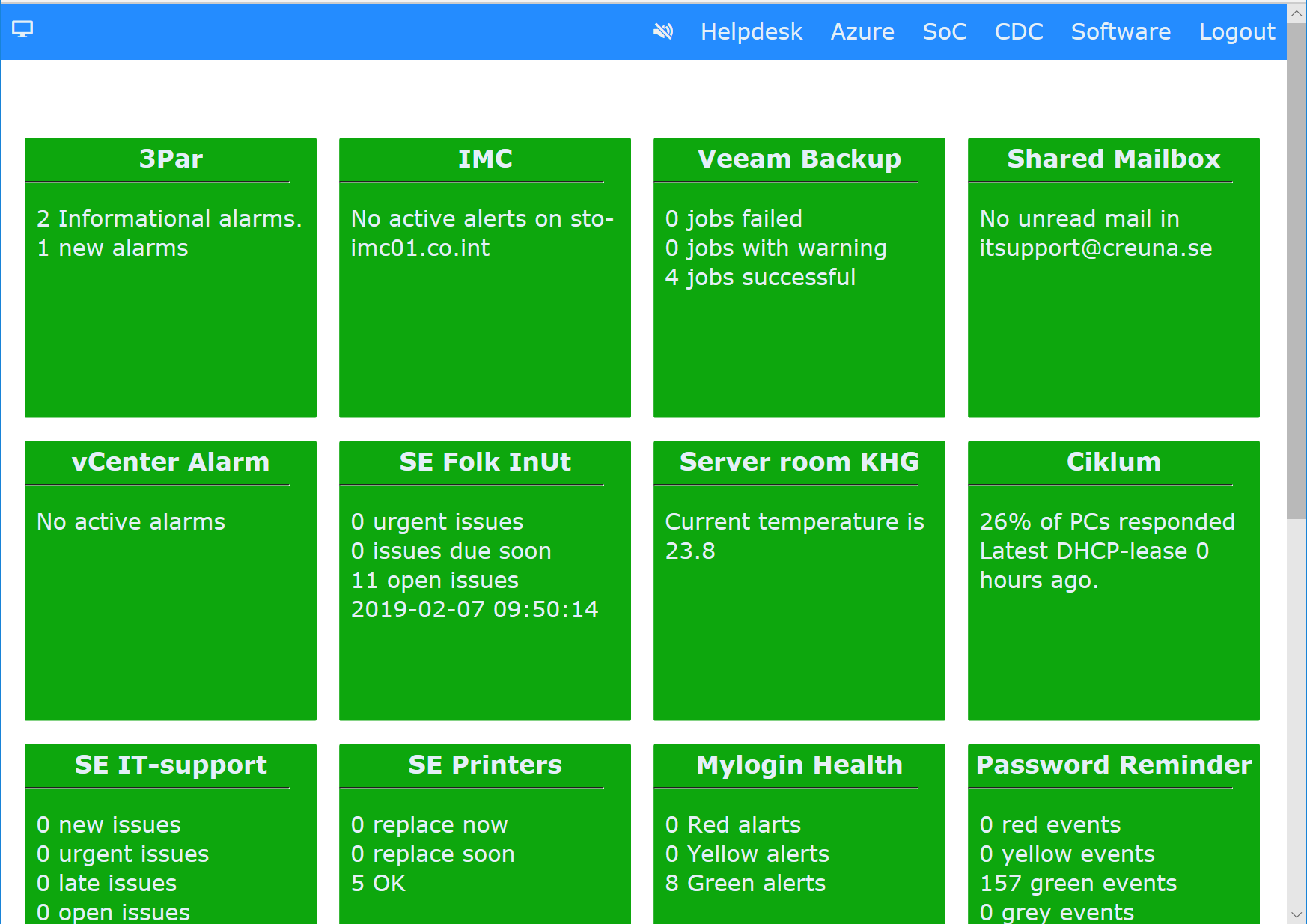
The GUI
In logged in mode you’re supposed to be able to click the headline of a detector and get more info (that may contain sensitive information and therefore must be tucked away behind a login). In logged out mode you’ll only able to see the color of the detectors and a short summery. This mode is supposed to be truly public and available for anyone. This would also be the mode that a wall mounted monitor would show. The overview. On the top bar you’re able to filter on detectors for a specific area, for example “Azure” or “Helpdesk”.
I plan to make a series of posts on CURE with more details and some learnings.
P.S.
Yes, it’s an acronym. Company Unified Real-time Events. Forced? You betcha.
The personal experiences, viewpoints and opinions in this blog post are my own and in no way represent those of the company.